Well actually, it’s just one card…
but lately it seems like it’s pretty much all I do, whenever I get to sit by the scrapping table. Create cards.

Who would have known, eh? I used to think that I could not do cards at all. Not saying that I can now, just saying I do quite enjoy making cards these days..

Especially when I get to play with little bits and pins and trinkets from Maya Road :)
 These always enhance any project :)

And that’s pretty much all I get time to do these days, with 2013 being full of part time studies and lots of exciting and fun projects and stuff to do at work..

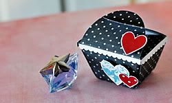
I did manage to sneak in quite a few simpler, smaller tag/gift wrapping projects for Christmas…but I grew tired of photographing them, they all were on the simple side..although this one was a tad more elaborate…
Right. Here’s to the new year… I wish for continued exciting projects and to get to explore more amazing stories at work… for more time to do the things I find fun, interesting and meaningful… and for a little more creative me-time in between as well.. :)