Yes, yes, allow me to cheat and present to you the Top 15 layouts of 2010, and not top 10.
I’ve been miserable and sick the last six-seven days (goddamnstupidassflu making me oh so miserable, both feeling miserable and making the people around me miserable (sharing is caring?), I’m so serious it’s not even funny…I’m like a goddamn man when I get sick *wink*), so please indulge me :p (luckily I already had most of these Best of-posts already scheduled or else I hadn’t really had the energy to even think about that).
Nevertheless…top 15, shall we? In no particular order..
I really adore this one. The colors, the transparencies, the felt, the stickers…the rub-ons… and, there’s an image of my mom and dad too, yay :) I think this was for a challenge, although I can’t recall which one atm…used mostly Hambly Screenprints for this one :)
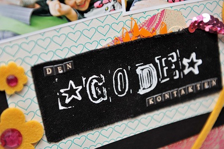
The challenge was about using a non-scrap-item or something like that – so I took a burlap-tag from a pair of new pants and used it as a pocket for the tag here. I wish I could remember what challenge it was, I think it was one of the Norwegian challenge blogs.
This one was for the Crate Paper blog – based on Emily Pitt’s sketch for Crate Paper. Loved the sketch and what it inspired me to make :) I think I used mostly School Spirit here with some Snow Day.
I also like this one because it’s about a good memory :)
I love this layout for its simplicity. Creating shapes outta buttons ain’t revolting new, but still oh so effectual. The paper is from 3ndypapir.
Love the whimsicalness of this layout; besides, it reminds me of the style of Ronda, although I’m not sure how to pinpoint that – the retro’ness and the whimsicalness? Here I used stuff from Crate Paper.
I just had to add this one too. One – look at the backgroundpaper! BamPop! One of the supercute but oh, so impossible to use ones. At least I’ve felt so for quite a few year, but was determined to some day use it – and yay. Here I combined it with lots of tags from Elle’s Studio, as well as a cute little metal-button from Pink Paislee and the bestest letters (so small but not too small, and oh so versatile) from American Craft :)
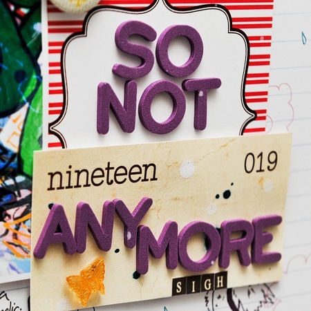
Plus for using a picture of me and my beloved high heels (which I haven’t been using regularly for soon two years now mind you..sigh..the layout is just about that…that I’m too old for this shit and it’s sad to realize)
Can’t let go of a chance to show off my legs haha. I sure like this angle, makes them look so super elegant and stuff bwahaha.
I also like that I’ve used a lot of rub-ons, bling and the small scalloped scissors on this layout :)
I wasn’t sure whether to add this one or not – it feels a bit different from the other layouts, and not because it’s text only. Or maybe because it is? I’m not too good with the journaling on my layouts, but this time – I had a blogpost (I can’t recall if I actually posted the blogpost or not) and looked at the journaling and thought I needed to scrapbook this, here’s the journaling I’ve been missing in so many of my layouts.
Bonus for using this lovely collection from Fancy Pants Designs, and the rub-ons and the glitter die-cut and the swirls and the flowers..yeah!
The reason I love this layout? I actually managed to use cardstock as the base! I’m so bad at using cardstock, I’m more a patterned paper-lover, so unless the cardstock is white I usually don’t use it when I scrap. I’m fairly sure this was based on a sketch, although I can’t recall which one atm.
I love the color combo of this layout, and that I actually managed to scrap this seemingly impossible (colorwise!) photo – me, my sister and our grandpa on the ice rink at Valle Hovin. Here I used a mix of hm..the background was from…hm..Prima I think? Yeah..the papers from Prima, rub-ons, stickers and transparencies from Hambly Screenprints :)
I love this one because it’s my mom in the pictures, when she was young and in a sort of model-lady-training-session :)
And I love this one because of the lovely layering and the awesome images (my first…and so far, only, helicopter-trip!) Mostly Hambly Screenprints + Luxe Designs (stickers) and the background is from Scenic Route (loves!).
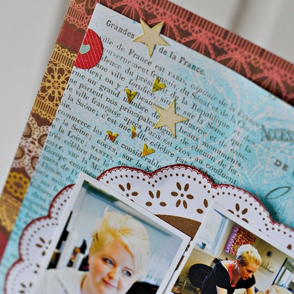
Combine the elegancy of Parisian Anthology and the romanticness (hm is that a word?) from Sweetness – both from Pink Paislee - and you can create pretty cute wedding-layouts like this one *smile*
Oh, and I actually was onboard on the banner-trend with this one too! Yay me! or something like that
This one I love because of the tapes methinks. They sure look cool, eh?
Love this collection – an older one from Pink Paislee – Amber Road I think it was called…and wish I had more of these papers *sigh*. The perfect collection for this emotional layout. Also like this layout because I actually got to use an Ibsen-quote here.
Aaaand I had to add this layout. Ofcourse. Another ave-beloved-high-heels-layout. Don’t think it’s necessary to explain why I love this layout, it just has it all no?
Hope you have enjoyed this little layout-walkthrough of 2010
I for one just want to be well enough so I can feel like scrapping again…the flu is so pesky, one day I was happily working on my DecDaily and the next I was just curling in my bed wanting to sleepsleepsleepsleep and then it just went downhill from there (in all fairness, I was sick for a while when I was in Oslo, but got better when we were going home (thankfully, being sick on the plane sucks), got approx one day of being ok before really driving off the hill the next). Exaggerating, me, nooooo
I’ll be back soon with the last post – Top 10 Minialbums of 2010. Until then..stay healthy!













Hovin, Whee and the last one about high heel boots have to be my faves- so colorful and mod!!! Love all the pages here. Happy New Year, I can't wait to see what you create in 2011!
Herlig topp 15 liste!! Du er jo kreativiteten selv. Jeg beundrer den lekne stilen din, alle de morsomme detaljene og de spreke fargevalgene. Du har dessuten en lekker håndskrift. Jeg kan sitte å se på LOene dine og plukke små tips og detaljer i lange tider. Det jeg liker aller best, er at hver og en LO er forskjellig, og humoren i titlene. Mine favoritter blant LOene på lista di er Dream og Whee... To vidt forskjellige LOer, men kjempekule begge to. Tusen takk for masse inspirasjon!
Ha et riktig godt nytt år!
let me tell you...i´ve just found you and i think your layouts are AWESOME, absolutely beutiful all of them...love the colours you used.
you are in my top list right now :)
xoxo
Oh dear, I hope you're feeling much better now Ania! Keep yourself warm and drink loads of liquid! Get well soon!
Anyway, I love ALL of your pages, whether it's top 10 or 15, they're AMAZING ok? OK! :)
You collection is just STUNNING! gorgeous gorgeous work!
get well soon .... no choice given here if you notice. get well soon and stop being cranky. LOL.. love you!