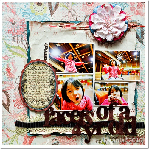
Yesterdays Pencil-Lines went live with the support of Prima Marketing, who’s our sponsor this month (yes – join the challenges this month and get a chance on some lovely new Prima-stash!). Our guest was Primas own Sharon Laakkonen, who also provided the sketch this week. I followed the sketch fairly close, using a mix of both new Prima-stuff and some old favorites. And yes, the title says “facets of a four year old”, not “faces”. I mean – you see different sides of her in all the photos – the “princess of the world” posture, the “ohwell” posture, the “seriously mom stop taking photos now”- face and “making silly faces so mom will stop bugging me” posture.

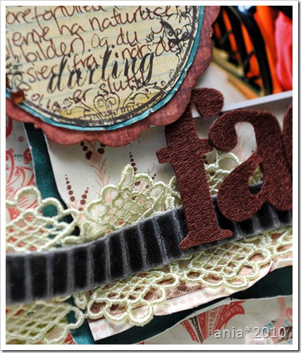
As mentioned – whipped out a few Prima-oldies here – the journaling note, the ribbons (actually it’s three ribbons glued together to one sort of) and the felt alpha (*love* them!!!)

I’m not quite sure if I have shared the stuff I’ve had published last year, but I do believe I’m allowed to share now, so here they are…:

Another layout that ended up in { Entre ARTistes }, this time w/Hambly Screenprints, American Crafts and yeah, more glimmermist :)
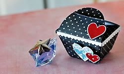
A Valentines chocolate box, shown in Paper Crafts issue Jan/Feb 2010
Made of mostly Fancy Pants Designs, along with little bits and pieces of this and that. Love using feathers, satin-ribbon and tulle for romantic stuff :) 
And this was a mini I made from Hambly-stuff, for Scrapbook Trends Mini Albums issue..
And a layout for the adoption-section in Scrapbook Trends September 2009 issue, with one of the first photos of me and my mother when I arrived Norway as a wee little baby. Made with Hambly Screenprints.
That’s it for now – but do come back soon – I have a fun surprise for my blog-readers later this week……:)
Title: Hedonism – Skunk Anansie


These are all supeeeeeeeerb! I don't know which one I love most...!
But I know one thing: You've got excellent taste in music. :)
Å her er det jo inspo overload! ;) Så mye lekkert! Likte spesielt adopsjonssiden, og de til EdA. Digger fargebruken din :)
dom är helt fantastiska allihopa!!! men den största favoriten är nog adoptions layouten, so so gorgeous<3
Wonderful layouts, especially the adoption one (being an adoptive mom myself, this is close to my heart)!
Herlig lekkert wow
;o)
Mvh
Jeanette