By popular demand. The photos from the layout in the post below, unedited (just resized):
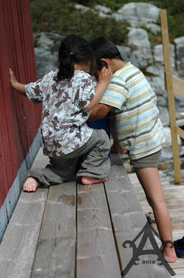
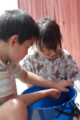
Tbh I think the color's a bit dull - I'd prob want to increase the contrast at least.
Sunny piccies = washed out colors normally.
Alright.
From my fuss about levels and curves being totally basic. (see prev. challenge - post below :p)
I like levels and curves.
This is just a general thing dependant on the picture itself. Just to give you a general idea how to make it better..here when it comes to these kind of photos - that is - underexposed.
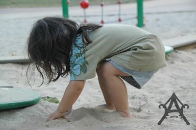
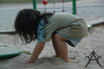 This is the orig file. Not that bad really. Just dark and a tad grey (I think ND-filters..or was it UV-filters? I keep mixin the diff. filters....enlight me if you know for sure please - are supposed to help a little on the "natural" greyness/dullness that's normal with most photos.)
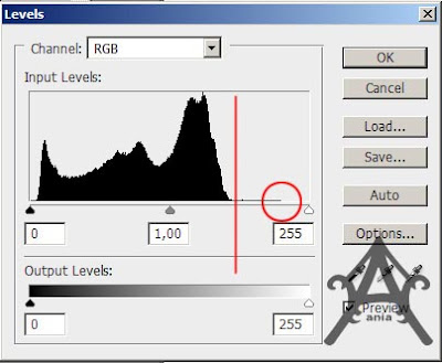
Anyhoo.. look at it's histogram:
A histogram is kinda supposed to have all the black areas somewhat evenly spread all over kinda..or a nice modest peak towards the right area of middle.. (all those lines represent how much % of a certain color is represented in the photo ranging from black to while at the extremes...afaik anyways :p So a full 100% line at the total right means theres pure white somewhere in the photo kinda..a packed peak to the right = prob burnt out areas in the photo...). This one is kinda stuffed in the middle/to the left. Indicates some underexposment. So what to do? Pull the white arrow to where the info start - see circle. Or, if you're feelin bold, push it towards the red line, like I'd prob do. This means that some areas/colors will be really really overexposed (clipped I think it's called? Like..lost info. I think. Ugh. Don't quote me I'm tryin to understand and remember the lingo :p). Anyways. Your choice as to what to go for. Personally I don't really mind clipped areas that bad....depends on the overallphoto...yes I am babling and don't really know what I'm babling about so just feel free to ignore me :p
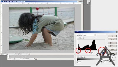
I decided to just pull the white arrow to where the info actually started. Decided to push the black arrow a lil to the right too - even tho it wasn't really necessary to go so far as I did. Lastly, the middle arrow was shot a lil to the left to brighten the middletones of the photo further.
See? Now we're starting to get a nice photo. Not that underexposed anymore and it feels brighter and thus prettier on the eyes ;p
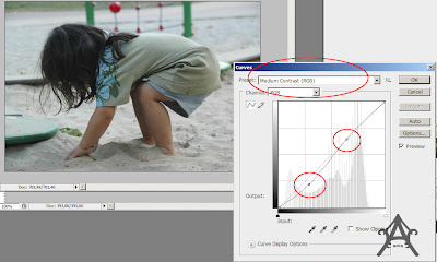
Now, I wanna make the colors pop a little bit. Strengthen the contrast.
Cue the curves-window. I love CS3. I don't think the presets are there in CS2 (actually I haven't checked tho PS2 is still installed on the PC. Me lazy :p).
Normally I use Linear Contrast - sometimes Medium Contrast is needed (NB: Medium&strong contrast usually ain't good for faces/skintones. Use masks for these cases - paint over the faces w/ some opacity if you want to use medium/strong contrast but think the faces looks ugly when you do so but only the faces - the rest of the photo looks good. Also, use "add layer -> adjust" for easier&quicker access to the masks & easier editing of the curves even after you're done with it kinda). Don't have the presets? It's ok. Just make a slight S - see the circles as to where to put the points at approx. A medium contrast is heavier at the bottom - linear one is more stuck to the middle/slash-line.
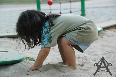
Yey - a nicely contrasted piccie.
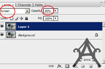
Now, I'm really into overexposing photos. Me like.
It's a personal preferrence. Copy the layer (ctrl-j. Or alt-j. Can't recall atm :p). Change the mode to screen. Lower the opacity - here I felt 65% was nice enough for this photo - but often an opacity of 15-25% is better as I usually overexpose my photos incamera when possible - hence having a brighter startingpoint already kinda.
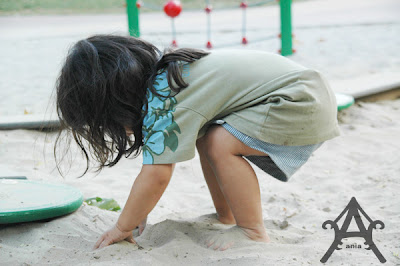
Yey. Brightish photo. Me like.
Finish the photo with a lil sharpenin - now this part is pretty much nitpickin on my part - the difference is there but just slightly kinda...but ohwell.
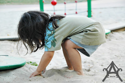
Tedah! And to refresh your mind; here's the orig photo again:

Btw. I took an underexposed photo as an example to just show what I mean w/ the histogram "having" to fill the whole histogram-area kinda. Normally most of my photos aren't this bad... I think... I just shoot a lot of photos and delete the "wrong" ones unless I really love them and think they're worth tryin to save :p Hm. Which I often do. Hm. Jeje :) I also suppose you could just go straight the the screen-part then adjust the curves after you've merged the layers. Not sure what workflow is best and if you'd really get the same results :)
Anyways. I am no expert, I just try stuff and use what seem to work for me and often w/o really knowing what I do..like..the tech aspect (hence me tryin to learn the lingo properly and me babling....babling usually makes me think things more through...which I think is good..kinda...but which doesn't mean you should take the babling too seriously.) ..Im sure those of you who really know PS will just laugh at what I've just wrote cause some of my attempts on explaination prob is off and stuff and a real photographer would prob snort at my love for overexposing hence losing details/info in some areas in the pic so really, don't quote me on this whole thing! :p
So if you really wanna learn more about photo-editing; go to fotopia (for norwegians) - excellent site with good and informative tutorials from a real real certified PS-pro :) Personally I've lately learned stuff from photomags.....there's usually good tips and tricks in them aswell along with CD-ROMs where you can try the same thing as explained in the mags (I like Digital Camera Magazine. Have tried two other mags aswell, one very PS-heavy - a lil too PS-ish for me as I think it kinda borderlines on..uh..digital cheating or well, digital art/painting...retouchheavy...I don't know..I'm still undecided on such stuff..wheter I think it's ok/good or too "cheat" ..and another fairly ok balanced one. Can't recall their names - but theyre all UK based. For some reason most if not all of the English photomags in the local stores here are from UK, not US afaik.)
Ps. I don't know why I keep tryin to discredit myself. Cause I guess...I do spend and know a lil more about PS than the average person after all..and whatever I do..it certainly seem to work for me no? Which's the whole point really. Hm. Must. Work. With. Myself.
Ps2. Yes. I know about actions. I LOVE actions. Still as I mentioned some posts ago. I decided I wanted to try learn more about the manual process.....to like, learn the process properly.... I suppose it would come in handy some day. And to me...it feels better pushin the action-button to make your workflow easier when you actually know what it does - like, see this post about actions and adjusting them :p And I kinda do dare think that most of my everyday-photos these days looks great w/( just raw-editing +) slight postprocessing in PS. Hrm. Ania. Stop. Babling. Making. Excuses.
/babling off!
Ps3!! Tonight!!! the Bad Girls Christmas Workshop will start! YAY!!!



Hihi, takk for store bilder! Så bra at du tar deg tid til å skrive ned litt om bilderedigering *imponert*.
Jeg er helt avhendig av photoshop, synes ofte bildene er for mørke.
*dåne* hva er det du ikke kan Ania????? IMPONERT!!!!!
stilige bilder!!!! får sette meg inn i dette jeg også!
Thank you for this tutorial! You are an angel Ania!