banner
Get off the cross we need the wood

About Me

Maybe-not-really-20-something-anymore from Norway who likes to scrapbook and take photos documentarystyle and dreams of photojournalism when not working as a photojournalist and that's pretty much what this blog is about. And I like it this way.


My Scrapbooking

Been scrapbooking since late fall 2005. Currently fortunate enough to be a part of the design teams for Hambly Screenprints, Fancy Pants Designs and Pencil-Lines. ♥


2/2

~~ How to scrap real simple :p ~~

Posted by Ania On Friday, January 29, 2010 5 lovely comments

Once in a while scrappy bloggers explain their scrap-process and I for one really enjoy reading about why people do the choices they do when scrapping, following exactly how their layouts came together.

Figured I’d do the same just for fun. Just because :p
(Only difference being that I scrap pretty simple, so it´s nothing exciting or "new" really, but ohwell :p)

This layout started with these two post-it notes. My oldest one wrote down some fave-sites on the post-it note to the left. The youngest punk saw the note and decided to copy it on her own. She keeps doing that these days – loves to copy letters and stuff. Ofcourse I thought this was pretty cute, and decided to keep both notes & scrap them.

First task was to figure what to use. I wanted the cute elephant-transparency (from Hambly) in lime. And I wanted to be better at actually using my transparencies, and have admired Sasha´s (an incredibly awesome scrapper whose official Hambly-work I´m missing) useage of transparency on plain cardstock in the past. Decided to go for dark brown, and to use it on kraft. Added a third yellow rectangle to balance up the two notes. Odd numbers are sort of better than even. My initial idea was to have the dark brown cardstock as a slim rectangle in the middle with the three yellow notes spread across it. I even cut the transparency & cardstock the way I thought I wanted it. I’m usually impatient that way.

Anyways. Turned out it didn’t really work out visually as I had thought. Bummer.

So I rotated stuff some and played around and saw something that might work.. The solid block of cardstock anchored the three notes. And the transparency I already cut was wide enough to cover two of the notes, which seemed to be more aestethically pleasing than having it covering the whole place (and having to find a new transparency to cut into :p). Goodie!

And found a leftover-photo I never got around to scrap. A generic photo which could be used for this. Yay.

Figured I’d use this Studio Calico-stamp as my title..

..and thinking the layout needed something red to match the picture. Found a perfect sized strip of Hamblys "Le Romantique"-paper that was left over after cutting it into lettersize for an earlier project.

Mmm nice. Adding red to the layout really refreshed it!

There – journaling added (I like journaling to be added in strips instead as a solid block of text on cardstock), title about to be stamped. Love using ministaples btw :) (For Norwegians: BAMBI som fåes i bokhandelen er desidert et av favorittverktøyene mine til scrapping - liten, nett og søt og ikke minst SOLID - stifter gjennom så å si alt :) )

I’m not really into stamping, and usually think it looks too plain/flat when I stamp w/reg ink….so decided to emboss the title, making it more shiny and stand slightly more out :p

Thought the layout needed just a teeny bit more red splash though (plus - having the color red thrice on the layout is good)…

And since I’m sorta weird and usually prefer to have some sort of visible edges on my layouts I decided to add a red frame around the center. A slightly whimsical one, as I've never been one for rigid c&s-ish stuff.

Pulled out my sewing-machine ofcourse. Tadah. Me like. Three yellow notes. Three red elements on the layout. Anchored bottom. Enclosed by a whimsical frame to ease up the rigid-ish centre. Mm I’m satisfied. Even though I sort of think I’m not too good at embellishing and tends to keep stuff pretty basic. OHwell. Can’t win’em all.

Hope you found this slightly interesting and didn’t mind me babbling about this particular process. I’m usually pretty impatient and cut stuff first before really checking whether it actually fit the layout or not sorta. Kinda a go-along-and-see-what-happens kinda scrapper. (aren´t we all?)

:)

Materials used: Hambly-papers and transparency, Studio Calico-stamp & gelly! embossing-powder.

Have a nice weekend – I know I probably will, with a few scrappy friends cropping with me here tomorrow…..just hope they don’t expect a shiny clean house cause…cough (oh, who am I kidding…you know me, rite? Ignore the messiness! ;p) :p


5 lovely comments

... I wanna wish it all away ...

Posted by Ania On Wednesday, January 27, 2010 1 lovely comments

Last weekend I was in Oslo to attend a photography-workshop. One where we got to work with studio-lightning, a real model & stylists and stuff. It was decent - at least I´ve tried that now and (I hope) feel a bit more safer if I get to work with studio-lightning sometime. Being an amateur, it seems to me it´s quite easy to get technically perfect photos once the light & camera-settings are set - then it just boils down to how to position the lights (imo - preferrably so you get interesting shades in the photo) & work with the model(s) & communication & visions.

I´ll probably share some images later (we did what I´d call glamour-shots I guess, even doing a few shoots in bikinis&stuff...:p) - but I feel so lazy - I haven´t even edited them yet (they seemed to need very little post-processing by the way - studiolightning & having a make-up team is pretty cool that way).

But. Before I attended the workshop, mom threw a little get-together for me, reminding me she hadn´t seen me since last summer. And I hadn´t seen my sister or nieces since last spring.. dad, aunt, uncle and grandma was there too. I even finally got around to meet my sisters (not-so-new-anymore) boyfriend. It was nice being with them again, and being around people who spoke sign-language. All Amalie signs these days is "good night" and "thank you for the food". Hope to be able to bring her next time so she can refresh her sign-language further :p

Anyways. Mom saved this gingerbread-house for me.

Just so I could snap photos of my nieces smashing it to the ground (or table :p).

(ps...see the canvasses in the background? I did the photos. At least those of the girls.)

Yeah. Smashing a gingerbread-house is fun, even for a young girl growing into a young lady (*sigh* I remember her being a little baby....not too long ago!).

I like the play with shadows in this image here (taken outside the bathroom, she was impatiently waiting for her turn and leaned towards the wall & the lamp there). I really ought to explore shadows more. Embrace them. And stuff.


I´ve been scrapping a bit lately - too little for my taste - but still some. For future assignments though, so I don´t really have anything to share here atm. Sorry!


Title - "Yellow Ledbetter", Pearl Jam


1 lovely comments

~~ but she couldn’t find how to push through ~~

Posted by Ania On Friday, January 22, 2010 3 lovely comments

Currently omw to Oslo to attend a photography-workshop. One about the useage of studio-lightning and stuff. Would be handy to get some kind of basic knowledge I think :) Wish me luck :)

I’ve been scrapping too. But I can’t really share that layout right now (it’s for the next-next Pencil-Lines), but as it’s the first layout I scrapped with the new Pink Paislee-stuff so I’m like, dying to share. So I’ll share a peek I guess. *smirk*

Have I mentioned how I’m totally dying over the flip-notes and the ruffled organza-ribbon?? Yeah, well, I am. Schweet!

And – as this weekend marks the start of CHA (Craft & Hobby Association) I figured I’d share some of the fave new stuff “my” manufacturers are coming out with.

Pink Paislee:

artisanelements_600

Umm….tape (or rather – Artisan Tape)!!! Gorgeous Artisan Elements, made outta a (to me) new material – a combo of foam and resin. I’m incredibly curious as to how it actually looks and maybe more important, feels in real life.

queenbee_640

And – I am loving loving loving all the new lines of theirs – loving the rich and colorful colors (hm, can you say that? Isn’t repeating oneself?) of the “365 degree” and “Bayberry Cottage” lines, and also maybe pretty surprising to myself – the amazing color-palette of “Queen Bee”. I dunno. It really doesn’t feel like “me”, yet I totally adore it. So sophisticated. So elegant. So gorgeous! Ahh…

If you head over to their blog I think you can still join the giveaways for all the new stuff :)

Fancy Pants Designs:

6a00d8341d658d53ef012876f5acf8970c-800wi

Of all the four new lines of Fancy Pants Designs, I’ve especially fallen in love with “Road Show”. It looks soft and mellow and lovely… but – knowing how things usually turn out I’ll probably be a more frequent user of either of the other lines – it’s always like that. I fall in love with certain collections but end up finding others more …uh..reachable. Sort of.

6a00d8341d658d53ef0120a7f29b23970b-800wiI have no real clue what this really is, but it sure sounds intriguing and promising! :D From the blog it says: “In this first release from our Artist Edition series: Super-sized metal frames, 12x12 Specialty Notebook, Unique Mixed Media Album and Innovative, Bulb Shaped Safety Pins!” :D (oh wait, I’ve seen the MM album one, it’s awesome – both the shape & materials it comes in :D)

There will also be a giveaway at the Fancy Pants blog sometime next week, when finished showcasing all the new stuff :)

Hambly Screenprints:

Hearts

Umm. Hearts!!

6a00d83451dcff69e20120a7f89f19970b

I really love these patchwerk-rubons at first glance. Imagine all the fun and quick&easy cards you can create with these!! 6a00d83451dcff69e2012876fbb9ef970cOh yeah! More lace – more specific – lace-borders as rubons!! Bloody brilliant!! :D

Have an awesome weekend whether you’re going to CHA or doing other stuff. I sure hope I will (and if nothing else, I’ll get to see my fam & hopefully also nieces again :) ) :)

Share/Bookmark


3 lovely comments

~~ update diz way! ~~

Posted by Ania On Tuesday, January 19, 2010 3 lovely comments

Did you see the new Pencil-Lines post?
With the new and enlarged DT we split in two groups, so I’m not due until next week – but do check out what the other girls did this week! :)

This layout was for the product spotlight over at Fancy Pants, on the Vintage Valentine Die Cut Papers :)

I dunno – I may think I’m so hilarious&clever now (spelling “diz” instead of “this” - ha-ha – and if you wondered – that’s to be read as a dry/sarcastic “ha-ha” sortof), no idea how I’ll feel about this in a few years. Ohwell. I like it now though! :p (and yeees I suck at blogtitles too so eh yeah :p)

I dressed the strip-paper up w/white tulle and made a plaid edge outta it on the..eh – edge :p

I really wanted to make this as romantic as possibly, so I grabbed a few very old bits & pieces (old as in being on my table or shelf for YEARS!) to put together this flowery blurb. Kinda like how it turned out :)

The hearts on the die cut paper got the glossy accent-treatment, so the hearts stood out a bit. Pwetty!

Here’s a Hambly layout I did the other day.

I hate how it’s photographed – it’s so much prettier irl. *sigh*

Have I mentioned how I love wideangle+close up?
Shot w/ISO 2500 btw =)

I just followed this girl to a birthdayparty she’s attending, with this little giftbag:

A tube-formed giftbag, made outta Fancy Pants Designs’ “Dancing Girl” papers and stickers.

Although I loved the colors of this collection, I initially wasn’t sure if it was “me” (despite me having a little girl :p) – but it has proven to be quite handy – especially when needing to whip up something for little girls.

The ribbon on the tag is tied to the clip (from an older FP line) which holds the sides of the “bag” together. I purchased a few “Hello, Kitty” watches on ebay for such occasions – but the bag they came in looked drab, so I think I’m gonna make such cute custom bags for all of them whenever needed.

My first CHA box arrived today – sweetness!! (Being an international at CHA times usually sucks – my dt-boxes are either delayed or I don’t get anything until after CHA. But hey, I really shouldn’t complain should I? *cough* ;p)

bayberrysneak2_6401

Anyways. The box was from Pink Paislee – and seriously – it’s gorgeous gorgeous gorgeous. You may chose to not believe me, considering I’m on their team and obviously would sort of be impartial and all, but really – I’ve always loved how their products seem so sophisticated and they truly truly do not disappoint this time around at all. Just look at the colors (above) – looovely – and the flip notes!!! Gorgeous! I’m in love!! Check out the peeks on their blog and comment for a chance to win some Pink Paislee goodness you too! :)

I see Hambly just came out with a peek aswell (the two first images got me all excited!! Love the screenprinting), and Fancy Pants Designs will soon start their peeks aswell, so keep checking in!

Other things I’m looking forward to CHA-wise (from what I’ve seen so far):

  • Cosmo Cricket’s collaboration with Core’dinations with awesome cool textured cardstock.
    (and their new lines looks pretty dandy aswell – I’ve really loved their last few collections and am glad they’re continuing coming out with stuff I personally like haha)
  • I am in love with the bright colors of Lily Bee’s new line appropriately named “Hello Sunshine”! So need to get me some!
  • I have to admit I haven’t been that big of a fan of Crate Paper in the past, but there’s something about the colors and design/pattern of the new lines that seem enticing to me.
  • I’m intrigued and hope to be able to try out both the Shimmerz Pearlz or Tattered Angels Glimmer Glaze, which both seem to be glimmerish paint..?
  • Prima always pull out awesome designs and especially gorgeous embellishments – this CHA is no different. I’m especially rooting for the flowers with glitter/glass beads on them and I think I spotted a few lines I wouldn’t mind bringing with me home :)
  • Once again Sassafras is different that what’s out there (imo) – lovely (slightly) kitschy & retro. I really love the design, look and colors of the new lines, but am not sure if I would be able to scrap with them. Wouldn’t mind giving it a try though! :D
  • October Afternoon hasn’t disappointed with their latest collections, so I’m excited to see what’s new from them – haven’t seen anything yet…
  • Collage Press is another small manufacturer that have had lovely lines in the past (I like how they seem to be full of colors and grownup-ish in patterns), so I’m also interested to see what they’ll come out with next.
  • And ofcourse – American Crafts and their colors and patterns never fail to make me happy :D (And I’m loving the new Dear Lizzie collection – esp patterns, colors and ribbons!)
  • Studio Calico is also worth mentioning – I really like their attempts at the paper-market.

What about you? Seen anything worth drooling over lately?


3 lovely comments

~~ and all this time ~~

Posted by Ania On Tuesday, January 12, 2010 7 lovely comments

Been listening to some old old faves on itunes lately…♥

(title’s from “All this time - the pick me up song” by Maria Mena)

Pencil-Lines went live past sunday with the brand new design-team!! Truly loved seeing everybodys take on the sketch, made by this weeks guest Susan Dupre :) It’s so invigorating seeing the (new) different styles doing the same sketch – fun fun! :)

I pulled out the “Frosted” line by Fancy Pants Designs for this one – cannot express enough how much I lovelovelove the vibrant, fresh colors used in this line!! Soooo *loves* :)

I’ve mentioned it before, but I don’t mind repeating – sticking stickers on corrugated papers & cutting around it (this time w/a scalloped scissors) = fun :) :) Gems by Prima & KaiserCraft.

Also - while editing these photos in Lightroom I figured I’d stop being so obsessed by +clarity and rather go the opposite way – turning the clarity-slider pretty far down the negative scale. It yielded a pretty dreamy look – like filtering the photos w/gaussian blur – just prettier because the focused areas still remained fairly sharp. Lovely effect – I’m usually no fan of excessive blurring of photos (like, prettifying/glamourifying photos and smoothing skin and stuff – often it just looks so so fake imho), but I can do an exception every now and then I guess.

Okes – off to finish dinner – someone (not me :p) returned to the univ and have late classes/hours some days, so late dinner for us tonight! :)

Share/Bookmark


7 lovely comments

~~ Me – a freelancer ~~

Posted by Ania On Sunday, January 10, 2010 11 lovely comments

Figured I’d share this here too..

'Cause this was my first “real” freelance-gig as a photographer and a huge responsibility and I’m happy I was recommended for this job (and that it went, all things considered – read below, very well) :)

I just got the paper myself in the mail (an intern-paper for ISS Norway called Avissen) – the pictures below however are screenshots from the pdf-version of the same paper. My assignments were to take a headshot of the region-director of ISS Facility Services, and to take photos from two different workplaces where ISS Facility Services was at (Hanøytangen for Bergen Group and Haukeland Hospital for Helse Bergen). avissen1

He was really nice – despite me being an hour delayed to the appointment because someone decided to crash into my car. My first accident w/car (ugh) and I was shaky – my car was parked – I was gonna ask someone about the way – and someone didn’t see me and reversed right into my car. I got the final letter a few weeks ago saying that everything’s fine – the other parts insurance-company pays for the whole thing thank god – considering it wasn’t my fault (and if I had opened my car-door to step out as I contemplated I’d be seriously hurt as he crashed full-speed into my door). Anyways – I was devastated – not only because of the car and all, but also because it meant I was seriously delayed for this shoot and + another one I was gonna do after this one. Thankfully he was nice and understandable and even offered me lunch before the shot++ About the photo – was slightly worried about the sun and all, but external flash+fill light worked great here :) (note to self – maybe it’s about time to investigate in a reflector..??)

avissen2 At Hanøytangen :) Some of the guys here lifted me upon a vending-machine so I could stand there and take this shot :) avissen3

See that background? Love these rigs :)

(yeah, it’s the same place where I did the aerial shots of the rigs for the newspaper :) )

avissen4

Am pleased they liked my photos and wanted to use quite a few of them :)

(I especially love the photo on the top left, the woman standing in front came into the room when I was shooting and she was so happy and smiling all the time that she totally made the whole photo – she made everyone smile & relaxed and happy sort of – imo it really looks like a real commercial-style-photo kinda (you know, the kind with perfect people smiling perfectly & all that – but here’s like, real people :p) :) And the chef in the middle photo was like “Picture? Me? I’m not really any good for such” but I think the photo of him is great..and I like the composition of the hospital-photo and the way the guy on the ladder is looking down :) Click on the images to see them larger :) )

All in all, it was a bit scary being on my own, freelancing for a company that had its main-seat in Oslo and all, but yeah – glad it went seemingly well :)

Am off – today’s familydinner at our place (turkey++) w/the older members of the family and my hubbys cousin (who’s the bride seen on the first layout in the post below ;) ) was coincidentally around here (she lives in France) so we invited her over too :)


Share/Bookmark


11 lovely comments

~~ Catching up… ~~

Posted by Ania On Saturday, January 09, 2010 10 lovely comments

First some scrappy layouts I’ve made lately, but neglected to share here on the blog – not happy with all of them, but..

Ok, I’m happy with how this one turned out. It was for Fancy Pants Designs’ productshowcase of the Vintage Valentine Cards & Strips. I used the strips-paper as my background, gessoing the edges before going over them with distress ink. Think it contributes to the dreamy look on the layout. The cards were cut out and sewn upon a background-sheet from the same line, with it’s edges distressed. On the bottom behind the card-sheet you can see this blueish glitter cut. It’s gorgeous and I thought it’d be nice to anchor the sheet with cards with it. Some tulle, feathers, a 7gyspsies-key and a SIIC-center from Prima and some tags with journaling makes this layout complete :)


A Hambly-layout where I apparently went a bit (too?) wild with the colors. Well, I honestly think it looks nice irl, but there’s something with this purple cardstock & pink rubon-combo which makes it look a bit weird when being photographed – it looks too neonish…? It kind of hurts my eyes – or is it just me?? It looks awesome irl though, trust meeee (or well, I do like how it appears irl much much better than in photo) ;p I made this layout based on Dina Wakleys sketch for Pencil-Lines. The woman on the pictures with me? A dear scrappy friend *waves if you see this* :) I’m glad you’re in my life & that you “get” the silly me :)

Love this Prima-flower!! :) It was sprayed with glimmer mist, but it doesn’t really show here (bleh).   This was a leftoverpiece from a KI lace cardstock. I turned it around & sprayed the white backside of it with glimmer mist and traced the edges with a pen :) Oh, and I went a bit wild with the Hambly rubons here – it was starting to dry out (ugh) so I figured I might as well use as many as I possibly could on this layout before the rubons were unuseable.


More play with paintsplatters & glimmer mist. I used papers from the new “Frosted” line from Fancy Pants Designs (love the vibrant, happy colors :) ), a journalingsheet from the “Dancing Girl” line, and various bits and pieces. This is my daughter and her best friend from kindergarten :)

It was made for the productspotlight for “Frosted” stickers – here’s the sticker I used – a bracklet which I adhered on a piece of corrugated cardstock. One of my fave-things to do with stickers and tags :)

A simple layout I did for Pencil-Lines #167 when Donna Downey was the guest and provided the sketch. Used just a cardstock+Hambly rubons. I dunno if I like this one – I think I’m too fond of layered layouts (w lots of dimension). This flat structure sort of is boring plus it’s very random in a messy way. Hm. Jeje. The layout is a sort of tribute to Marie, who’s a sort of craft-wizard. I don’t think there’s anything she can’t do craft-wise. :)


Oops! Thought I was caught up but forgot this one :) I made it for the product-spotlight on the Christmas Magic glitter cuts :) 
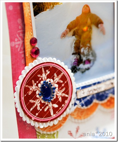
The photos are from the gingerbread-baking of 2009. I used papers from “Vintage Valentine” and “Christmas Magic” for this one, along with chipboard from Maya Road, doily-punch from Martha Stewart, thickers from American Crafts and bling from KaiserCraft :)

Here’s a closeup of the glitter cut I used – I cut it in two and adhered it along the journalingsheet from the same collection.

Mkay.

I had a little more to share than I thought – but – I think I should be caught up now at least.


Guess I’ll share the photos I did for ISS in a new post tomorrow (a freelance-gig I did earlier last fall which I’m sort of proud of :) ) since this post turned out to be a long one :p

The kids are making waffles in the background, I have my glass of wine (♥), there’s fire in the fireplace and I think I’m gonna do some more scrapping tonight! :)

Have a nice weekend :)


10 lovely comments
    -Get off the cross we need the wood-