banner
Get off the cross we need the wood

About Me

Maybe-not-really-20-something-anymore from Norway who likes to scrapbook and take photos documentarystyle and dreams of photojournalism when not working as a photojournalist and that's pretty much what this blog is about. And I like it this way.


My Scrapbooking

Been scrapbooking since late fall 2005. Currently fortunate enough to be a part of the design teams for Hambly Screenprints, Fancy Pants Designs and Pencil-Lines. ♥


2/2

~~ Sketches2Scrapbook: Winter Wonder Land! ~~

Posted by Ania On Sunday, January 30, 2011 3 lovely comments

sketches2scrapbook_logoWinter

Do you have an iPhone? Or iTouch or iPad? And do you scrap? Then you might be aware of Anam Stubbington’s iPhone-app Sketches2Scrapbook, loaded to the brim with sketches for you to lug around on your iWhatever for quick and easy inspiration (great for crops!). Well, she just released a Winter Edition of the application, loaded with 66 new sketches (+ the usual 12 free ones you can get in the free Lite version).

I have the original Sketches2Scrapbook-app and I think it’s an awesome idea in itself, so I was pretty honored (and flustered!) to have been asked by Anam to contribute to the Winter Edition.


ania155


Here’s my layout featured in the Winter Edition-app (the large, pay-version, which costs 3.99 dollar). I flipped and shrunk some elements from the sketch given to me. I’m glad I got this “Winter” assignment, because I had totally forgotten about these pictures and upon finding them when searching for winter-appropriate images I was like; “Duh! How could I have forgotten about these pictures!?” So yeah, I even scrapped the bottom picture twice, as seen here.

All the materials here are taken from the Crate Paper collection “Snow Day” apart from the alphabets which’s from Pink Paislee.


Right!

Have a few images to edit now and a few words to write…then we’re off to watch hubby play some badminton!


Btw, for Norwegians:

To kronikker verdt å lese: Eliertsens “Lærer Bjørndals metode” i BT (skum gjennom kommentarene og) og Rossaviks “Død over smilefjesene” i Morgenbladet (fikk meg til å reevaluere min egen bruk iallefall, og kanskje bli litt mer bevisst - men det er vanskelig – bruken er tross alt blitt en intrigert del av det å skrive og analysere tekster fortløpende! Er enig i det at offentlige innsatser og formelle brev/mail/kommunikasjon = ikke bruk smileys, dog :p).


Hmm..and for the English-readers….as to not leave you out (I was sharing interesting Norwegian newspaper-links above): NY Times Bill Keller recounts his dealings with Assange and WikiLeaks – an interesting read, as well as What’s Happening in Egypt Explained (an earlier edition, which does not seem to be updated atm, but seem to give you a quick insight as to why)

Right. Really back to work now.


3 lovely comments

~~ My precious.. ~~

Posted by Ania On Thursday, January 27, 2011 5 lovely comments

Upon receiving Crate Papers gorgeous Portrait-collection, I immediately knew I just had to use this to scrap my pictures of my beautiful nephew, Kasper Milan, who was born in November last year.

It’s truly a classical, sophisticated collection with a hint of romantic vintage. And as you can see – apart from a few of the stickers and chipboard, it’s not that themey at all. It’ll work swell with photography-themed projects as well, and I already have a few ideas for my next projects with this collection.

And look at my nephew….*sigh* I miss him so much…the hardest part of not living close to your immediate family (at my side anyways) is missing out on so much when it comes to the children..

Now, the turquoise flower used here is a die cut from the collection pack (if I am not too mistaken) – it’s in cardstock-quality. However, the same die cut is also available as chipboard if you buy the chipboard-sheet. The “Love” sticker is taken from the alpha labels, which feature two different kind of letters plus a number of phrase-labels and stickers. It’s adhered to one of the red papers and cut out with my scalloped Fiskars scissors (I love doing this with stickers and die cuts). The yellow thing on the top is just a leftover after using the yellow border on the layout – it was one scallop too long for my taste Smile with tongue outOh, and Crate is doing buttons too by the way :)


This flap was created from one of the larger squares from the accent cuts, folded in half.

Love the gentle touch the ribbon gives this photo, and um, look, fabulous wooden buttons!!

Have a closer look, will ya? :)
(yes, I know, one is upside-down, didn’t see it until I was done and I was like, bleh, lazy, done! Smile with tongue out)

kasper_cu3

Here the folder is opened – another image of Kasper and some journaling :) The yellow background is a sheet of the 6x6” paperpads, which shrinks the patterns perfectly.

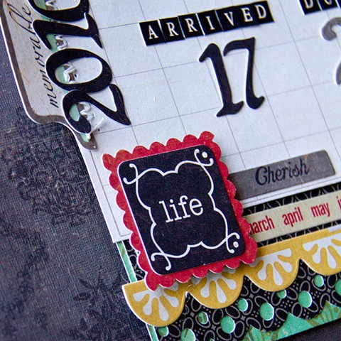
One of the papers has the most amazing black and greyish pattern on one side (it’s used as the darker paper in one of the layers for this layout – you can see the scalloped end of it here in the peek), and a calendar on the opposite side. I used “November”, adding the due date and the actual birthdate on it.

I also love the monthly + yellow scalloped borderstickers used here..


Thanks for allowing me to share (and thanks to Eli for letting me borrow her camera so I could take these images in time for the Crate blog presentation seen here, as my babies were away for the clean&check thingie. They are home now :p).


Heather (goldiecar) Said,

8:24 PM

I think that the Sasafrass Deer is the cutest thing I've seen!! Makes me want to break out mine and play!!
PS. The other cards are amazing!

Thank you! Do break it out, I am trying to cull my stash here but it’s an impossible task because I am way too attached to all the papers and the stuff that I have, having no to little desire to part with most of it – so I am at least trying to use what I do have…even though it’s hard I must admit… *sigh*


ParentesFantomet Said,

10:14 AM

Kule kort!
Forresten, hvor leverer du kameraene til rensing og sjekk? Mulig jeg burde få mitt sjekka og da hadde det vært fint med et lite tips ;)
Ha en fiiin dag

Har jo Nikon-utstyr, og er så heldig at Nikon-reparasjonssenteret ligger på Åsane i Bergen, rett ved IKEA…..noe som gjorde det dyrt for meg siden jeg “måtte” innom der både ved levering & henting..kremt…men jeg trengte de tingene jeg shoppa, da! De tok tidligere imot Canon, men sjekker/reparerer ikke for dem nå lenger. Vil tro at de største fotoforretningene også tar imot sånt, iallefall for viderelevering, du får sjekke med dem (lokalbutikken her tar kun utenpå-rens, og det klarer egentlig jeg sjøl og :) ). Min D700 gikk på check&clean garantien (gratis check&clean i 3 år), mens jeg måtte betale 450,- for D70s’en.


Mari Said,

10:45 AM

lekre kort! Og lekre bilder med Iphonen!!!
Du, jeg trenger sååååårt fototips på hvordan få FINE LYSE bilder av lo'ene mine!
Little yellow bicycle har ikke kunnet brukt noen av dem i katalogen pga de er så mørke de mine...:(
HJEEELP!:)

Hm tjah, lyset er viktig, ser på bildene dine at de ofte gjerne er guloransje/har varm fargestikk i seg pga innendørs belysning (da bør du helst stille inn hvitbalansen på det – se etter en av de to vanlige lyspære-symbolene og prøv deg frem + etterjuster i et redigeringsprogam). Det beste er å bruke naturlig lys, duset gjennom vindu eller hvis direkte sol, gjennom lette hvite gardiner som duser ned lyset… suppeler med ekstern blits om nødvendig (på-kameraet-blits funker ofte dårlig til sånt, men om du må kan du prøve å duse den ned litt med ett lag hvit serviett foran kanskje? Prøv deg frem). Bruk så curves til å justere exposuren på bildet (altså lysne litt mer + justere kontrasten).

Jeg synes forøvrig at det å ta bilder av prosjektene er noe av det kjedeligste jeg må gjøre (ok, nest etter å laste de opp i ørten gallerier da :P), for selv om jeg har hvitbalanse-cap og bruker manuell hvitbalanse kan det ofte bli mye jobb med å finne riktig hvitbalanse i ettertid (mye mer enn om jeg tar bilder av mennesker og sånn synes jeg, sånt er kanskje mer merkbart når man tar bilder av små prosjekter?) + sjekke at lyset er jevnt (som regel er layoutene lyse på den ene siden og litt mørkere på den andre). Småpirk kanskje, men utrolig irriterende, særlig når man skal levere DT-greier..

Er det noen som har noen enkle, foolprooftriks når det gjelder fotografering av layout&kort og sånn?


5 lovely comments

~~Oh, deer ~~

Posted by Ania On Tuesday, January 25, 2011 7 lovely comments

I’m without my babies for a few days. They needed their yearly check&clean, and I won’t get them back until maybe tomorrow the soonest (yes, I am talking about my cameras :p). The two first images below are therefore taken with my iPhone (the last card was created a few days ago, haven’t gotten around to share it until now).

deer

My mother-in-law asked me to create a birthdaycard for a friend whom she was going to give some hike-stuff for gifts. Looking through my stuff for something hikey-ish I found these Sassafras-papers and decided to use it. It’s created from one sheet of paper, from which I cut out the yellow “sky” and the deer from the scraps and attached them to the front with 3d-foam. A bit busy cover, but I think it works. I’ve also rediscovered liquid pearls. I only have the grey one, and I think I need more!

jewel

ColorComboJT14

And here’s my two last contributions to the Moxie Fab Color Challenges, the above is for the Jewelcolor-challenge. I like this colorcombo :) The ledgerpapers looks pretty reddish here, they’re more sand in reality. And the felt flower on the top looks blackish, it’s actually the same color as the purple flower. Ahwell. It’s a good image still considering it’s taken with the iPhone, no? Looking for the right colors in my stash made me mix manufacturers here, something I don’t get to do too often *smile*. The papers here are from Sassafras, American Craft and Making Memories, the felt-flowerfrom American Craft , the button from Fancy Pants Designs and the tag is from Elle’s Studio.


metallics

ColorComboMT4

This one was a bit tougher, as it was supposed to be a “metallics” challenge.

I decided that “metallics” could also include glitter :p Hence: Pink glittercardstock from Doodlebug, champagnesandish metallic shimmercardstock from Bazzill and a Scenic Route chipboardheart dressed up in silverwhite sugarglitter from Doodlebug. I even found an epoxysticker from Love, Elsie to place on the card :)


Now excuse me, I have an article to finish, a questionaire to create and last, but not least: My box with the CHA-goodies from Crate Paper has arrived!! Am so gonna dive into some happy scrappy time tonight! :)


7 lovely comments

~~ Lazy Sunday ~~

Posted by Ania On Sunday, January 23, 2011 6 lovely comments

Compared to yesterday, today’ll be a lazy Sunday. I’ll just edit some images and write an article or two if I’m effective (but hey, who are we kidding?).

grey

In the meanwhile, here’s my contribution to the “Grey is the new black” challenge over at Moxie Fab. I’ll admit, I don’t have many (if any) grey papers in my stash, and I don’t stamp nor use cardstock much, so what to do? Pull out the Pink Paislee “Parisian Anthology”-collection and paint it lightly with Graphite glimmermist so it’ll turn a gorgeous, uneven grey hue and slap this fabric flower, also from the same line, on it, duh. Ta-dah, or something like that.

giftgroup

And then we have this little trio of gifts, also created with Pink Paislee – this time with the “Starlight”-collection. It’s a box of chocolate, a CD-envelope and a miniwrap. Read what the chocolate box is saying? box_open

This is what it reads when you open it (I love to think I’m so clever Smile with tongue out).

This is my contribution to Sukkersøtt, a Norwegian challenge-blog which’s atm is about decorating chocolate-boxes Smile.


Speaking of Pink Paislee, have you seen what they are coming out with this CHA? Their peeks starts this coming week, but from what I have seen on their web and from the House of 3 and Tattered Angels collaboration - I’m so so so bummed I’m not on their team anymore, because this stuff will certainly ruin me when it’s out in the stores!!! *soft sigh*


And then you have Crate Paper, which I’m so relieved I’m on the team for because.. look at these two last peeks! And check out their blog for the full reveals, the samples from the team are simply amazing! Here they all are..:


6a00e55210ddf588340147e1d228fe970b-800wi

I believe Portrait will be my total fave (but I’ve been wrong before)…

6a00e55210ddf588340148c7cfb862970c-800wi


Emma’s Shoppe will most surely become the 2nd fave (it’s girlie but not too girliepinkpink, and with darling patterns and colorpalettes).

6a00e55210ddf588340147e1ccf0c4970b-800wi

And Neighborhood looks so sweet and mellow :)

6a00e55210ddf588340147e1c6b8a2970b-800wi


And toy box, the dark horse which, after having seen the full collection on the Crate blog, will most surely be used a lot in this home!


To see the full collections AND have a chance to win them yourselves, head over here for Portrait and Neighbourhood and here for Emma’s Shoppe and Toy Box!

Have a lovely Sunday Smile


6 lovely comments

~~ See why I love Hot Chocolate? ~~

Posted by Ania On Friday, January 21, 2011 7 lovely comments

utpatur

More creations for my guestDT-gig for My Scrapbook Nook: this is a layout created with their January-kit, which heavily featured Fancy Pants Designs’ winter-y collection “Hot Chocolate”. All the papers and stickers here are from that collection, while the buttons were added from an older FP collection.

utpatur_cu1

I love using thicker thread on my sewing machine! Why didn’t I do this earlier!?!?

utpatur_cu2

The letters are from American Craft – originally they were white, but I colored them with a red, permanent marker to fit my layout better.utpatur_cu3

I love scalloped circlepapers, but too often they have me stumped as to what to do with them (I know – create circle-layouts….still…doesn’t always feel right to me). So I’m pretty satisfied that I managed to incorporate this paper on this layout.

winter

And this is a quick card created from scraps from the layout above, a sticker and 3d foam. Quick, elegant and easy. And more important – no scraps to hoard around forever!


Right!

Today’s my day off, and a friend insists on teaching me how to crochet (she so has no idea what she’s in for). I’m ambivalent and dubious and highly sceptical, but have caved in to give it an attempt. Besides. I’m just gonna do the basic squaretightcrochetingthing. Nothing fancy. I’ll be fine….I think…


7 lovely comments

~~ Pink, Pinker, Pinkest? ~~

Posted by Ania On Tuesday, January 18, 2011 3 lovely comments

Lol, I know – it’s pink, more pink, then..uh..I’m not quite sure….totally pink? :p

kristiane

Just wanted to share a pink card I created. Now, normally I’d probably not make a pink card. Hm. I know I most likely wouldn’t – not like, all pink, at least. It’s so cliché. But. Challenges, you know?

Oh yeah, another one of Moxie Fab’s color-challenges…I wonder if I’ll actually get to finish them all within the timeline? Three down, three to go afaik. Life’s bit busy atm, working on questionnaire-drafts for my MA (it’s NOT as easy as I thought! I have to be short, precise and I feel the need to over-define the meaning of words I’m using in the questionnaire to make sure to prevent misunderstanding of concepts and blah blah, especially for the online survey-part) and freelancing for the local newspaper…but hey, – I enjoy this life so far :)

ColorComboM7

Nevertheless, here’s the three pink colors we were supposed to work with..mm…(it’s adhered to the gift, which’s kraftwrapped, so please ignore the kraft part for this challenge) the paper’s from Pink Paislee’s Sweetness-collection, a scrap I had lying around here – letters from Fancy Pants Designs, and the flower from Prima. The stamp is an all time favorite, the only one I kept of all my wood-mounted stamps (because let’s face it, I so suck at using stamps) because I knew I’d reuse this one at least…it’s hm, Anna Griffin if I’m not too mistaken. Loves.


So long, gotta continue working! :)

Ps. I changed the threads I’m using on my sewing machine, with a thicker thread – now it’s so much more visible and I love it! Give thicker threads a try yourself too, if you haven’t yet :)


Oh, and before I leave…check out these peeks from Crate Paper!

6a00e55210ddf588340147e1a6446e970b-800wi

This is the boy-line…see the neutral alphabetpaper (I assume! I haven’t seen this collection myself, as it’s on its way overseas atm!) ? Lovesit! Am not too sure about the army-stuff, whether it’s actually patterned with these motifs or if it’s just for the AD, as personally my kid doesn’t play with that, but we’ll see – I totally approve of the colorscheme!

6a00e55210ddf588340148c7b993fe970c-800wi

And this is apparently the girl-line – hello insta-love! Yes, please!

There’s two more lines to be revealed, keep a close tab on the Crate-blog for these in the next few days!


3 lovely comments

~~ Playing with My Scrapbook Nook ~~

Posted by Ania On Monday, January 17, 2011 3 lovely comments

JanKit11A.jpg

Yay!

I’m finally able to share that I’m the January guestdesigner over at the My Scrapbook Nook-kitclub!

It’s especially fun, as the Januarykit was chock-full of “Hot Chocolate” from Fancy Pants Designs, the collection that debuted after my term with them were over. So it meant I got to play with that collection after all, yey! :)


I quickly created two layouts and a card with it, and I have plenty of stuff left (and ideas for more) so there’ll be more stuff created with this kit incoming in not too long :) So – embrace yourself, here’s my Nook-stuff so far:

heipappa

A layout documenting a trip to Oslo last year, with just me and Amalie – which meant frequent phonecalls home to update them on the events of the stay.

heipappa_cu1

Here I worked a lot with the Helmar Scrap Dots glue – I love that glue because it allows me to decide the dimension of my embellishments myself (it’s a “liquidish” 3d glue dot in a tube). And it’s perfect for me because I often leave my projects overnight, so it’s one of the last things I do before leaving for bed and the next day the glue is dry and good to go :) The glittery red brads are from Queen & Co, also in the kit.

heipappa_cu2

We got two kind of letters in the kit – white AC chipboard ones, and dark brown FP stickers. Yay!

Everything on the layout is from the kit by the way…hm..apart from the banner and the text-strips, which were just created by scraps I had on my table :p

kaffelade

Kaffelade! A small, cozy café downtown.

The white cardstock is from my own stash – in fact – I had it premade (adding splatters of glimmermist onto it), thinking I’d use it for another project a while ago, but decided against it and saved the cardstock for future use – aka this project :)

kaffelade_cu1

Love this butterfly-punch from Martha Stewart – so elegant :) And the borderpunches :)
I actually created the borders for the first layout-project above (“Hei, pappa”), decided not to use it and then just adding it here where it fit better.

kaffelade_cu2

Use that negative space! :) The bling seen here are from the kit – we got a red piece of swirl from Queen & Co in the kit – and I have to admit I find such swirls a bit hard to use – so I just cut out individual gems from it for my layout.

kaffelade_cu3

Love this kind of splatter – huge, with random edges :)

minicard_back

You know these 12x12 sheets with smaller cards/tags on them? Look for two fitting cards next to each others, which can be cut out together and used to create such quick minicards.

minicard_front

Here I just added bling and letters to the cover of the card..

minicard_inside

And decorated to reinforce the insides of the card with more pieces from the same 12x12 card-paper.

minicard_cu

And added this cute little sticker-stamp, adhering it with the liquid scrap dots glue.

ania221

Now, I have to admit – while creating this layout I loved it, but now I positively dislike it. Hrm. Still have to share it though, as it’s for the Pencil-Lines sketch #221. White cardstock, transparent glittercut and felt from Fancy Pants, houndstooth-tape from Pink Paislee, paperscraps from Bam Pop, lots of rubons from Hambly Screenprints (the rub-ons I own are so random, while some are drying out, others are still going strong even though they’re among the oldest ones.

I’ve decided I’ll be better to use the rub-ons I own because quite frankly, it SUCKS to have to throw away whole sheets you just wanted to hoard because you loved them too much to use them…..:(

Nevertheless. Do check out Cheryl Ashcrafts sketch, it’s pretty lovely!


~Sasha Farina~ Said,

1:20 PM

paperdolls? what are you? 8? LOL.. *i'm just jealous by the way.. :P*

But ofcourse! *huge grin*  Love you still! Open-mouthed smile


Have a lovely week! :)


3 lovely comments

~~ In the mood for another card? ~~

Posted by Ania On Saturday, January 15, 2011 4 lovely comments

annabelle

Hm well, I’m afraid I’m leaving you with no choice ;p

(I’ll share two or three layouts in my next blogpost, I promise)

Nevertheless, my little missy is celebrating the birthday of her friend atm, and I noticed this card was posted on the Scrapbook Trends blog (for their felt challenge), so I figured it was about time to post this one now.

Created with Fancy Pants Designs & their Frosted line, along with flowers from Prima and Petaloo and decorated generic pins (the leaf one is from Maya Road). The felt heart is from Fancy Pants by the way. I so need to be better at using my felt stuff, they’re so adorable to decorate with.


januar 15, 2011-2


This is how the ground outside looks atm by the way – wet, hard, slippery ice – ugh. So not looking forward to have to drive out this pathway onto the roads..but I have to :(


4 lovely comments
    -Get off the cross we need the wood-