banner
Get off the cross we need the wood

About Me

Maybe-not-really-20-something-anymore from Norway who likes to scrapbook and take photos documentarystyle and dreams of photojournalism when not working as a photojournalist and that's pretty much what this blog is about. And I like it this way.


My Scrapbooking

Been scrapbooking since late fall 2005. Currently fortunate enough to be a part of the design teams for Hambly Screenprints, Fancy Pants Designs and Pencil-Lines. ♥


2/2

~~ 5th bloganniversary tutorial: simple card ~~

Posted by Ania On Tuesday, March 16, 2010 39 lovely comments

Edit: the giveaway has now been closed & winner picked. Comments still open though, in case of question and stuff :)

Mkay, not quite sure what to call this card other than, a simple card – is it a tri or twofold? Hm. Does the “fold” part for a card mean how many folds there actually is (two here), or how many “pages” (three)? Hm. Someone enlighten me please :p

Regardless, figured I should just do a quick and easy tutorial for today – it’s by no means revolting or anything, I just find it…somewhat cute. More like a tip, kinda.

adriankort

This card is made outta a 12x6 inch long strip. Simply put – just cut a 12x12 sheet in half.

However, don’t fold it the “usual” way. Fold it like this diagram: card Don’t worry if you don’t follow the measurements exactly. Personally I just fold by eyeballing it. (I want a Scor-It or similar though!)adriankort2

Anyways. Slap a 5x5 (or 5 1/2 x 5 1/2) embellished square in front which will hide your smartass comment/greeting on the shortest flip when closed. On my card it’s just a cute “hooray for you” quote + an adorable little monster hiding behind the square. But I sort of imagine that a snarky/sassy comment would be fun to have on this spot (given that you actually know the recipient that well :p)

Materials used: Fancy Pants Designs – “Rough and Tough”, Kraft letters, little monster from “Trick or Treat”, Adornit miniletters.

Hope you enjoyed this simple card-tip.

Here’s another peek of what’s in the giveaway – you guessed it – Fancy Pants Designs goodies:

FPgiveawayA mix of older and newer (My Family! Straight from the CHA-W10 release! :) ) collections :)

To enter this giveaway – just comment away (dunno what to comment? How about suggesting a book to read for me? :) And while I´m on the topic of books, let me just declare that I *love* Neil Gaimans penship (penmanship?). Check him out if you haven´t already.)

Thanks a lot for playing along, and come back tomorrow for the last tutorial before the drawing of the giveaway on Thursday ♥ :) (and if you haven’t entered the giveaway before, feel free to check out the other posts – scroll down :) )

And yeah I love reading all the comments ♥ to those of you who commented on my worktable – yes – it’s cluttered and messy. I’d like to say it’s because it’s small, but it’s really not – my whole part of the office (shared office w/hubby & the kids, where I have 1/2 part of it and they the rest) is terribly, embarrassingly messy *blush* My excuse? “Hey, I’m actually using this space, that’s why it shows”. It’s a poor excuse though :p

And using mailtape as grownup-bangles - that´s an awesome idea (not sure why I didn´t think of it myself), I´ll have to check it out asap - thanks! :) And yes – I’m a Fiskateer – and that scissor is one of my total tool-faves!!! ♥ ♥ ♥ :)


39 lovely comments

Edit: the giveaway has now been closed & winner picked. Comments still open though, in case of question and stuff :)

I’ll be the first one to admit that uh, sketches isn’t really my forte. Not if I *have* to follow it step by step (although in some cases it’s the most simple and actually the best solution). But – if you can allow yourself to handle a sketch quite freely without really feeling you have to do this and that because it’s on the sketch then it can be a wonderful startingpoint. And that’s what it is to me.

It’ll tell me how many pictures and elements I’m supposed to use, then it’s up to me to see during the process depending on what I have for hand if it’s actually necessary having this and that on the layout or if I’ll just ruffle it up and flip and add and deduct and put together and whatever.

Now, that being said – if you’re entering a sketch-contest you might want to double check what’s allowed to do with the sketch – some allows you to flip or mirror the sketch, others are more rigid. If it’s a contest then the rules laid down needs to be followed imho, and you really ought to be able to see on the layout that yeah, it’s the sketch alright – to make it just for everybody.

But if you’re creating just for yourself, just to get your project a flying start – then be my guest – do whatever you want with the starting point!

DSC_5555

I’ going to share my process of working with a sketch from start to end. My starting point here is this sketch found at page 88 in the new Pencil-Lines Sketch Book by Anna Bowkis, the founder of Pencil-Lines. (You can purchase the book from here and yes, you can also find several of my layouts in the book so yes, this is a bit of self-promotion :) ) It’s a pretty three-photopager with nice elements which can be interpreted two ways – either with the scalloped border as your 12x12” base, or with the larger frame as the 12x12” base. I chose the latter. You can see from Annas example on the same page in the book that she chose the first.

Here’s the original image of the sketch, courtesy of Anna:
sketch07

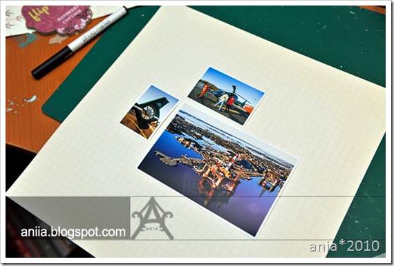
lo1 Picking out my photos from an awesome photo-assignment I had last fall for the job (I got to enter&ride a helicopter to shoot some photos of a couple of oil-rigs) – I decided I wanted a neutral-ish background to allow the colorful photos to really shine. I grabbed one of my favoritepapers ever – the grid one from Scenic Route (which’s gone now – the manufacturer. Bleh, so my stash of these papers are getting thinner and thinner :( Luckily Basic Grey have similar papers though – I guess I’ll check them out when my SR-stash is gone :p) Also note that I don’t really follow the orientation of the photo-elements that closely – I do try to follow the sketch but if the photo I want to use is landscape and the sketch says portrait - well – I don’t let it stop me if I like the photo or the sketch.

lo2 Now that my photos and base is decided, it’s about time to figure out what else to add to the layout. For these kind of photos I had a feeling Hambly would be a better match (from what I had on hand). And as mentioned – I did not want the photos to be overshadowed by the papers & patterns and stuff, so I opted for a transparency.

lo3

And some glimmer mist to add some more interest to the background. But ofcourse :) Grabbed a brush, shaked and opened the bottle and soaked the brush so I could spray larger splotches on the paper with my fingers running through the brush (not sure if I’m explaining it correct, but I hope you understand what I mean. I mean – this is kindergarten-stuff :) )

lo4See? Large, yummy splotches. This is Patina by the way. I't’s a bit lighter than Jazz Blue, but otherwise pretty similar in shade/color.

lo5 For more darker, vivid/opaque splotches I decided I whip up my distress ink reinker (demin blue), soak my (smaller) brush with it some and quickly dip it in a bit of water to dilute and make it easier to actually get the ink to get off the brush :p

lo6

For the square background (the scalloped one on the sketch) I decided to go with an oldie but goldie from Hambly Screenprints – a mini graph transparency in black. It would provide a nice background to the pictures I thought, without really taking any focus from the pictures themselves plus still allow the lovely splatterfun on the background to show through. I also decided to handcut the green “Hanging Heliconias” paper – I cut out three strips of them. I like how the Kelly-green color (note to self: obtain more scrappy papers in Kelly-green! Such a lovely color!) compliments the layout.
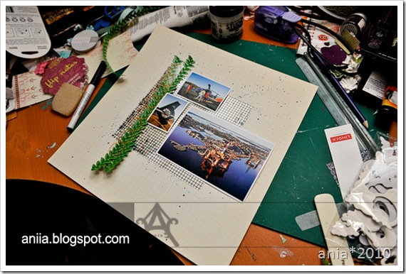
lo7 I ended up using two of the strips only though, because it seemed a bit overwhelming with three green strips. Swapped one for orange transparency though – it’s nice sticking to odd numbers when decorating.

lo8

I decided to staple the strips to the transparency before continuing. (I like to use my staples for pretty much everything. Especially when attaching embellishments that I want to still be a bit loose in the ends sort of. lo9

Pulled out my Luxe-labels. lo10

Decided that my title needed help to stand out on the layout, hence the label. lo11One seemed to be a little bit small on the layout, so I ended up layering two.

lo12

Threw a quick glance on the sketch and thought mkay, I can do something indicating the horizontal strip of paper. But I didn’t want it that broad (repeating: because I didn’t want it to steal too much attention from the pictures. I had a feeling solid patterned papers would in this case.) Ended up whippin up my Hambly Kraft stickers for this purpose.lo13

Only, I’m so cheap that I measure and cut stuff in two where it’s supposed to be covered anyways. What can I say. I love my Hambly! :p lo14Time to adhere the rest that hasn’t been adhered yet. Which was when I saw it missed something (apart from the journaling), did another look on the sketch and decided to add an orange strip across the main photo (notice how there was an “empty” space/square between two of the photos and the labels/title, where you could see the background-transparency? It felt like it needed to be covered – and it ended up covered – see below). When satisfied it was time to add the journaling. Which I intended for the right bottom of the layout. Only. Ended up with so much journaling that I think it skewed the whole focal point for the layout in the end – if I had been aware I’d write that much I might have tried to “move” the central focal point (the whole area w/transparencies and photos) a little more to the upper left. Ohwell.

Here’s the sketch again:

sketch07 And here’s the finished result:

whee

I think I did an ok job keeping most of the elements as they were on the sketch. When I work with a sketch I look at it in the beginning, trying to memorize how it looks – then while working on the layout itself I try to not look too much on the sketch, but rather pull the elements from my memory. It feels it’s easier then to not be stuck on something on the sketch that you might not agree with/doesn’t work for your project, and rather than getting annoyed or frustrated, just move on and do stuff on your own.

Materials: Scenic Route, Luxe Designs (labels and alphas), Hambly Screenprints, glimmermist and distress ink.

Hope you enjoyed todays walkthrough on working on a sketch/layout. Figured I’d do such a post on Sunday, as that’s when the Pencil-Lines sketch of the week is posted. And since we split the DT and it’s my Sunday off today I figured I’d post this one instead :)

pencillines

Also – as you might have guessed – there will be a copy of the Pencil-Lines Sketch Book included in the giveaway :) It's a mighty fine book (how can I say otherwise - I'm in that book *wink* ;) ) - spiral bound (HUGE plus imo), 40 sketches (including single and double ones) and three different interpretations of each sketch...you'll also be guidelined on how to use sketches and so on in the book.

So. Simply just drop me a comment (if you're not sure what to say, how bout - what's your stance on sketches? Yay or nay?) on this post and you’re in for the drawing of the huge giveaway occurring on March 18th (to see what else is in the giveaway scroll to the previous tutorial-posts :) ). For more chances on the giveaway, just add my blog to your reader/rss-feed and drop me a second comment. If you already do have my blog in your reader, and want a second ticket, just comment away :)

Also, if you’re new to this blog and missed out on the previous tutorials, just scroll down and comment away – they’re still open for new comments :)

See you all again soon with new tutorials and new winner-chances :) And thank you all so much for celebrating my bloganniversary with me :)


58 lovely comments

Edit: the giveaway has now been closed & winner picked. Comments still open though, in case of question and stuff :)

Thanks so much for all the comments entered already! :)
Today I’m gonna do a fun tutorial inspired by the Hambly Screenprints make’n’take at CHA W-10, where they decorated wooden bangles with Hambly rubons. And ofcourse - with this new post there's a new chance for you to get new tickets to the giveaway :)

bangles_tutorial1 My bangles however, isn’t made of the wooden kind. It’s not really wearable by me either. It’s too small. But it’s great if you have kids in the house – kids with slim hands. Like my four, soon-to-be-five year old daughter. And I bet you have the resources at home already. Or will in a while anyways :p I made hers from used glue dots rolls. I’m sure you can find cheap wooden bangles in craft/jewellery stores and stuff. I just haven’t been looking :p

bangles_tutorial2You’ll need gesso. It might not be entirely necessary, but it helps preparing the material for the paint applied later on (and also means you’ll need less paint sort of). Apply it everywhere on the rings. Apply it twice – and allow it to really get dry in between. I placed them on a sheet of scrap cardstock and put them a safe place so I could work on something else in between the drying. (Oh, and this is where my hands are pretty much covered in gesso because I find it more fun using my fingers than looking for a brush or applicator….)

bangles_tutorial3Time to apply the paint. I went for red and black. Crimson red with touch of satin finish (such a lovely color) from Marie’s acrylic paint (a pretty cheap brand). The black used is “Pitch Black” dabber paint from Adirondack. Just unscrew the dabber-top and – again – use your fingers (or look for a new brush/applicator) to apply the paint. If using fingers like me, make sure you only work with one color at a time and wash your hands between the colors ;p Apply this coat twice, letting the paint dry in between the coats.

bangles_tutorial4Apply rubons. Just let the motifs continue around the edges and stuff. This rubon comes from a toy-store (My Little Pony ♥ )

bangles_tutorial5

Feel free to apply rubons on the insides too. Kids loves that! Apply some kind of coating medium/sealer on the bangle afterwards, both to protect the rubons&paint for wear and to give the bangle a cool look. Like with this Glossy multi-medium from Claudine Hellmuth Studio. Gives it a really shiny, glassy finish.bangles_tutorial6

For the red bangle I used gold “Doilies” rubons from Hambly Screenprints and a satin matte spray sealer. Gave it such a lovely look :)

bangles_final

Here’s the lucky wearer of these bangles – she instantly loved them and keeps bragging to everybody who wants to hear that her mommy made these for her ♥ (I’m thinking it’s ok, she’s only four, she can brag about her mommy all she wants *wink*)

primagiveaway

Hope you’ve been enjoying the tutorials so far :)
Here’s another peek at what’s inside the giveaway – lovely Prima stuff (pretty much all of my faves are in there) and some Hambly too :)

For another chance at the giveaway where one lucky winner will get everything’s displayed till now (drawing happening at March 18th), just simply drop me a comment here. To get a second ticket to the giveaway, just follow my blog (see button to the right, or click here) and drop me a second comment. If you’re already a follower just comment and let me know right away :)

Stay tuned for more tutorials coming up :)


57 lovely comments

~~ 5th bloganniversary: CD-cover tutorial ~~

Posted by Ania On Thursday, March 11, 2010 119 lovely comments

Edit: the giveaway has now been closed & winner picked. Comments still open though, in case of question and stuff :)

cd-cover


Welcome to the first installation of the 5th bloganniversary-tutorials :)
We’ll start off quite simple, with this CD cover made out of corrugated cardstock & decorated with Hambly-goodies. When taking pictures for and/or sharing pictures with friends I try my best, time allowing, to make the “package” more cozy for the recipient. In this case, I shot some babyphotos for a friend of mine, and wanted to send her something cute she could keep the CD in.

cd-tutorial1

First – grab a sheet of corrugated cardstock. You can purchase sheets or rolls of these in pretty much all hobby/craft stores and most well associated bookstores as well. I love the white ones – they look so pretty and is quite easy to decorate with say paint or a dash or two of glimmer mist! :) But I digress… cd-tutorial2

Fold the corrugated cardstock together and measure your CD and cut accordingly. Remember you need it folded so it’ll become a sort of envelope for your CD. cd-tutorial3

Using a circle-puncher, find the median and punch out half the edge from one of the sides. This because it’ll make it easier for you to actually get the CD outta the CD cover later on ;p cd-turorial4

Doublecheck that it looks fine and will actually cover your CD. Remember to leave some room on the top and bottom for the enclosing of the sides.cd-tutorial5

Decorate the cover before you enclose the sides. Trust me, it’ll make the decorating much, much more simple. Here I used the Hambly transparency “Old Lace” in gold and some various Kraft-stickers mounted on 3d-foam. cd-tutorial6When done with the cover – enclose the edge either using a thin strip of strong double-sided tape or use your sewing machine.


Voila – quite simple and it actually takes 20-30 minutes top to make a little more thoughtful gift.

cd-coverHere’s Hamblys supercute “Onesies” transparency in teal used as the background, decorated with a few Kraft stickers, a tutrle-rubon from “Classic Animals” mounted on blank transparency and a cute butterfly-cutout from “Wings”. The letters are one of my fave letters from AdornIt.

cd-cover2 And here’s the CD cover which was made with this tutorial.

Hope you enjoyed the tutorial!

hamblygiveaway Here’s a peek of some of the yummy Hambly-stuff that you can win in the giveaway. Clear stickers, rubons (Gold “Doilies”! One of my total faves atm!), the awesome “Hambly Couture” – both a sheet of paper plus

I spot some of the new stuff too – Embroidery & Doily Decor papers :)

To enter the giveaway (which will take place March 18th) – simply drop me a comment on this post :)

If you’d like a second chance on the giveaway – feel free to post about this giveaway on your own blog and comment here once again for another ticket to the giveaway.

giveaway2

Come back soon – I have at least three more tutorials lined up for your entertainment – all of which means new chances to enter the giveaway :)

Share/Bookmark


119 lovely comments

Todays layout is one that’s pretty close to my heart because of the pictures. Isn’t what scrapbooking at the very core is about? Well, sometimes – or I might maybe say quite often – it’s the creative outlet which drives me the most. Anyways. (oh, scroll down for info on my upcoming 5th bloganniversary :) )

like_web

I know I’ve repeated myself a few times here on the blog, but really – watching my daughter & my niece interact together tugs at my heart because – they look so much alike me and my sister when we were little, and it’s like watching ourselves version 2.0 (although they’re much better friends than what me and my sister used to be when we were little ;p). So when I was going to do a “Word It” post on the Pink Paislee-blog my chosen words were “Family Ties”, using these recent pictures of ourselves together with the romantic and lovely “Cupid” collection from Pink Paislee. You’ll find more of my thoughts and more detailed info about the layout on the Pink Paislee-blog.

like_cu2 like_cu3 like_cu

Now for the 5th bloganniversary-info! :)

giveaway2

It´s quite silly how fast time flies the older you get. I mean - when I was a kid, the days and weeks were sooo long. And try to count down to the next holiday or birthday when you´re a child - it´s such agony - and when turning ten years - wow - I remember thinking - it´s such a lifetime! How am I supposed to wait to turn 13, 15, 20, 25 when time takes so long?

But now? The days pass by so fast, I get just as surprised every time we have to remember to write a new year in the date.

A few weeks ago I got a questionary to fill out, and needed to find out how long I had been blogging. Checking the blog I found out that oh - I´ve been at it since March 2005. March 18th, to be exact. "How cool", I thought, and immediately wanted to do something special about it and give back to those of you who pops by every now and then.

When I started blogging I hadn´t discovered scrapbooking yet, I was pregnant with my second child (who was due a month later - weird - no mention of me having given birth on the blog, but it did happen in April :p) and blogged mostly about gaming and little bits and pieces I had read on the web that amused me (oh, and I was an avid realityshow-watcher back then. I´ve grown a bit since ;p). I started blogging because I had been missing having my own droodling-space on the web, having had a website from 1995-2001 or so with a friend of mine (which was fairly popular in Norway back then, there were people writing universitylevel-analysis of our website and stuff, crazy :p).

Anyway! These days this blog is mostly about scrapbooking, and I suspect the majority of you who read this blog come here for that kind of stuff too (apart from my family, who complain I don´t write in Norwegian - sorry mom!), so I decided to have a weeklong anniversary-bash with a huge scrappy giveaway, starting March 11 and culiminating with the Big Day I entered blogosphere, March 18th.

The giveaway, which starts March 11th (tomorrow!), will contain lots of scrappy stuff (I’ll share more pictures of the giveaway soon), and will be open for everybody everywhere. Oh, and I´ll throw in several inspirational tutorials and stuff to the giveaway-posts. All you have to do is to come back here between March 11th and March 18th for several chances on the giveaway and to hopefully get a little bit inspired :)

So. Now you know.


Hope you’ll come back soon for the fun! :)

Share/Bookmark


8 lovely comments

~~ In one hand dreams a plenty ~~

Posted by Ania On Monday, March 08, 2010 9 lovely comments

Didn’t plan on two blogposts in one day, but my hubby had a surprise for me today when I got off work and I couldn’t resist…

Ever since I attended Dok10 I’ve been feeling quite inspired and itching to try something new. I got this idea in my head that I would try to plan a sort of a concept and do my best to execute it in a sort of artsy way. I had an idea - a cliché one, and I am honestly still not really sure about how to achieve the look I have in my mind (esp because it req the little one to actually cooperate with me :p) – but still – it’s better to try and have failed, instead of being annoyed with myself for not having tried, hm? Besides, it’ll still give me new and fun pictures even if they won’t stand up to my imagination. Anyways. I shared the idea with my hubby and hinted that he’d support me by purchasing a couple of balloons filled with helium next time he was in town…and he actually did o.O ♥

So, just had to test them out for a bit, although it was quite foggy outside and it started pouring down after 5 minutes, bringing the balloons down, so :/ – will see if I can get some time off work by the end of tomorrow and drive to the locations I had in mind with Amalie & the balloons (and yeah, wish I had better (prettier) shoes for her :/)….

DSC_5570 DSC_5591DSC_5635

Title: “Secret Spell” – Tori Amos

Share/Bookmark


9 lovely comments
    -Get off the cross we need the wood-